10.31.2016

Troubleshooting Color: Source Color Space


More than once I have been asked: "OK, so the color is wrong, how do I make it right?"

Troubleshooting CMYK color can be a pain, because there are often many places the problem could be lurking, and changes made in one, may inadvertently alter the output based on info from another. So in this five part series, we will look at five important steps to troubleshooting a color managed system, or colorimetric tuning.

As you all know, a color management system is usually broken into five parts:

1. Source color space
2. Media parameter setup
3. Source color space designation
4. Output color profile
5. Output calibration set


Part 1 - Source Color Space


Color files set up to be printed always use a color space, even when the exact color space is not known by the customer. In general, the source color space is either RGB or CMYK, and composed pages are often found to contain both. For most customers, RGB is preferred, since it offers a larger color gamut, and higher saturation levels.

RGB usually comes in one of two flavors: sRBG or AdobeRGB. The key difference is in the size of the gamut, with sRGB having a smaller gamut than AdobeRGB.

Any work produced on a Windows device will usually be in sRGB by default. RGB is usually preferred since most sources (scanners and digital cameras) generate RGB, and most display screens use RGB as a native representation.

Some customers use CMYK as a source color space, with many flavors possible; SWOP, GRACol, ISO, etc., each with multiple variants. (See the Definitions page for definitions of these and other terms) The CMYK color spaces are usually characterized by the achievable gamut of a certain printing technology (ink and press type) on a certain class of media. While designing in RGB offers more possibilities, designing in CMYK often assures the final output will be within gamut.

The CMYK source space may also be used to emulate the lowest common denominator of two or more digital printers/copiers when matching output between the multiple printers/copiers. 

In any case, the source color space and variant must be known for optimum output color. 

A tag or profile is frequently embedded into the source file to identify the color space being used. The tag may be directly read in the RIP's job parameters.  Embedded profiles, if present, should ALWAYS be honored.

If the source color space is not known or discernable, experimentation must be used to find the closest match.

Other parameters specified in the Source area of the RIP job setup pertaining to color are:

  • Almost always leave at the Full Output GCR default, allowing GCR parameters in the output ICC profile to specify black channel generation. Setting this parameter to Full Source GCR5 may cause color translation problems and should be avoided.
  • Rendering Intent : Usually set to Relative Colorimetric which assures maximum colorimetric accuracy of in‐gamut colors. The default Presentation designation increases chroma of many in‐gamut colors, often rendering them inaccurate. 
  • Photographic (Perceptual) also changes many in‐gamut colors, but may be useful if the shadows tend to block‐up.

----------

Do you have a color management question, horror story or event to share?
Email me at reilley4color@gmail.com

10.03.2016

Closed Loop Color

CLOSED LOOP COLOR

Before digital color management became the rigorous science that we currently use, print professional all had a bag of tricks to get their desired color results from a given printer. They had experimented, suffered, worked around and generally gotten to know their print device, warts and all, in order to get what they wanted from. Things got considerably more complicated when another device, like a scanner, or wide format printer was part of the mix.

Then when they got a new device, they had to start over from scratch.

This was Closed Loop color management, a tight bond between user and device.

Open Loop color management, however uses the "Universal Translator" concept, going from the input color start point color space (usually RGB of some kind) to L*a*b* color space - which is based on human vision, and a larger color space than any digital device - then from L*a*b* to CMYK+, according to the device profile of the printer. This allows users to plug new equipment into the mix without having to change color management setting for any other device. Essentially, it takes the input of any color space, then translates that to the output gamut of the print device.

As a method of color management, closed loop color is usually considered a mistake. However, some higher end production printers use Close Loop Color Control (CLC) to ensure color fidelity throughout a print run. The two concepts are very different.

Closed loop color is essentially an on-press feedback system that scans and measures the color bar on the moving paper (web or sheetfed) -- while the press is in operation -- and then feeds this information back to the press console to make automatic adjustments. When the color information recorded across the sheet: the ink density (or ink film thickness, and amount of light reflected off the press sheet) and the spectrophotometric data (or measurement of the hue of the ink) deviate from the specified levels, the closed loop system automatically adjusts the press to bring the color back to its target.

Why is this important? More and more presses include such measuring devices to ensure that the color you specify within your design application (InDesign, Quark, Photoshop) can be carried consistently from your computer to the printer's proofing devices and then on to the pressroom. This is also called color management.

So, remember the difference - the closed loop color management system is archaic and inadequate to modern CM needs, while closed loop control control is a breakthrough of technology that allows a digital press to maintain color throughout a lengthy print run.
n addition to color fidelity, additional benefits of closed loop color include reduced make-ready times, reduced paper waste and ink consumption, and the ability to save ink-presets for later use (i.e., to record all color information in the press console for later replication in future jobs).


----------

Do you have a color management question, horror story or event to share?
Email me at reilley4color@gmail.com

8.05.2016

How Color Print Tricks the Eye


Consider for a moment the marvel that is color printing.

It uses a scientific trick of lightwaves - Metamerism - plus engineering marvels that electrostatically charge a piece of media in very specific places, then release precisely placed, incredibly small grains of colored toner, and a developer fluid that reacts with the fuser's heat to bond those particles, all to trick your eye into thinking that a reflective surface is an emitting surface.

Hundreds of times a minute.

Or spray micro-drops of ink from two directions at once as the media rolls by.

And the controlled combination of colored toners or inks trick our eyes into interpreting a reflective surface as if it were an emitting surface. This is a trick worthy of magic, but really, it's science.

Here is a basic explanation of the color spaces involved with printing.

Simply put, the Cyan, Magenta and Yellow printing inks cancel out the Red, Green & Blue wavelengths of light coming to our eyes from the media's surface, metamerizing the wavelengths, tricking our biological processor into thinking it is the RGB of our human color vision.

Why red, green and blue? You may remember from science lessons in school - visible light is a spectrum of light, described as frequencies, ranging from reds through the colors of the rainbow into blues and purples.

From a scientific point of view, light can be a mixture of any of those monochromes, light of a single frequency.

However, we have light-sensing cells called cones in the retina of our eyes to detect the amount of light in the red, green and blue areas of the spectrum. Because of this, “true” monochromatic yellow light, which lies between red and green on the spectrum, is indistinguishable from a mixture of monochromatic red and green light.

From a design point of view, since we can’t perceive the difference, it simply does not matter, and so we can abstract any color we can see as a mixture of red, green and blue.

The science of digital color, however, describes color using the L*a*b* color model, among others, which is a bit less intuitive but more closely approximates how the human visual system works.

It uses the Lightness values of an image (the grayscale version) as an axis to rotate opposing poles of chromacity described as a* (red vs green) and b* (yellow vs blue) to describe the gamut of human color vision.

“But wait," I hear you cry, “You just told us human eyes sense red, green and blue!” That is true, it’s called the Trichromatic model of vision, and while it describes how the individual cones in the eye work, it doesn’t accurately describe the visual system as a whole.

Separating the human perception of lightness from color leaves the a & b dimensions as measures of chromaticity, brightness independent of color. This is important, as some colors appear brighter or darker, despite being at the same intensity.

For instance, we see a fully saturated yellow as a lot brighter than a fully saturated blue.

Regarding ranges, L is measured from 0 (dark) to 100 (light), a from -120 (red) to +120 (green), and b from +120 (yellow) to -120 (blue).

So let's look at the rods and cones mentioned above.

Human color vision takes place in the retina, and ends deep in the brains 's visual pathways.

The ventral stream (purple) is important in color recognition. The dorsal stream (green) is also shown. They originate from a common source in the visual cortex.

The retina is the innermost of three tissue layers that make up the eye. The outermost layer, called the sclera, is what gives most of the eyeball its white color. The cornea is also a part of the outer layer.

The middle layer between the retina and sclera is called the choroid. The choroid contains blood vessels that supply the retina with nutrients and oxygen and remove its waste products.

Embedded in the retina are millions of light sensitive cells, which come in two main varieties: rods and cones.

Rods are used for monochrome vision in poor light, while cones are used for color and for the detection of fine detail. Cones are packed into a part of the retina directly behind the retina called the fovea, which is responsible for sharp central vision.

When light strikes either the rods or the cones of the retina, it's converted into an electric signal that is relayed to the brain via the optic nerve. The brain then translates the electrical signals into the images a person sees.


----------

Do you have a color management question, horror story or event to share?
Email me at reilley4color@gmail.com

7.13.2016

GCR (Gray Component Replacement)


Experts agree that in color reproduction black can be beautiful if used wisely. Black can add details and contrast in the reproduction which is impossible to achieve with the three process colors. However, if the black is not used judiciously, it will do more harm than good. It will make the colors look dirty and create an unnatural contrast.

— Dr. R. K. Molla


Reseparating customer supplied files is rapidly gaing popularity with printers and publishers as a way to lower print manufacturing costs. Reseperating allows for greater control of the final output, including specific filtering for media, color management, and finishing options.

Although the application is not limited to specific print market segments - these are the ones that are most quickly adopting this technology:

• Newspaper publishers
• Insert and flyer printers
• Magazine publishers
• Catalogers
• Directory printers

Within the CMY color space, a range of colors can be achieved by combining the three primaries. This combination in its turn can be thought of as a hue component (which will require a maximum of two primary colors) and a grey component (a mixture of all three, in an appropriate quantity to give the required saturation). If the grey component is replaced by black ink, the same color is being achieved by using two primaries and black. The act of substituting a quantity of black for the grey component is known as "Grey Component Replacement" (GCR).

GCR is also termed "achromatic color removal."

In grey component replacement (GCR), contrary to under color removal (UCR), the CMY values that add to grey all along the tone scale can be replaced with black ink. UCR only adds black to the CMY equivalent of what would have printed as a grey or near-grey.

Although there are many benefits to reseparating customer supplied files in order to use GCR, the most promoted and fairly easy to justify is in regards to reduced ink usage - typically suggested as a savings of around 20% in CMY inks with an increase of about 6% in K ink used while maintaining the same visual appearance in presswork.

Based on that figure, calculating a return on investment seems fairly straight forward. For example - based on the industry average of ink consumption for a sheetfed printer being about 2% of their gross earnings, a $10 million dollar a year printer will spend $200,000 a year on ink. If they reduce their ink usage by 20% they will save about $40,000 a year in ink costs. Theoretically, if the printshop spent $10,000 on a reseparation solution their payback time would be just three months and they will have saved $30,000 in the first year of implementation - a very good investment.


This is the removal of the gray components of the three colors and replacing them with black.

In GCR reproduction, all the primary and secondary colors remain the same as the normal chromatic reproduction, however, the blackening effects by the tertiary colors along with the gray components of the other two colors are removed and replaced with black. 

Various percentages of GCR can be applied to the separation for economical reasons and visually more pleasing results. The black dot sizes are increased to replace the gray component that has been reduced in the process colors. If 100 percent GCR were used, every color area in the reproduction might contain dots of only black and two or three process color inks. 

Commonly used percentages are 50% to 75% GCR. The goal of GCR is more consistent color, increased detail in the shadows, shorter press makeready, and possible ink savings.

Advantage: GCR results in less ink being used, and some of that ink is black which is normally cheaper than the others.

Advantage: The areas where less ink is used are regions of high ink use, so the potential for drying and offset problems is reduced.

Advantage: The resulting output is less susceptible to changes in the printing variables since you are not continually trying to balance as much C, M, and Y.

Because a GCR separation uses a non-chromatic color – black – throughout the tonal range and reduces the proportion of C, M, and Y in the mid- and quarter tones, the color in GCR separated images is more stable as solid C, M, and Y ink densities naturally vary through a press run. Note, however, that the added stability means less ability for the press operator to move color if required. For many printers, the increased color stability is a perfect compliment to the industry trend for a “by the numbers” print manufacturing process.

Other advantages:

• Reduced make-ready times/faster start-ups/less wastage
• Harmonized separations enhance press form printability
• Reduced fan-out or web growth
• Dramatic improvement of image appearance when slight press misregistration occurs
• Reduced drying times
• Higher printing speeds
• Improved repeatability of print jobs
• Grey balance within images is more stable


Disadvantages of GCR include:
GCR may reduce the ability to adjust some colors.


--------------
Do you have a color management question, horror story or event to share?
Email me at reilley4color@gmail.com

5.23.2016

Munsell Hue Circle


“Popular color names are incongruous, irrational, and often ludicrous.” – Albert Munsell

This is from the opening of Munsell's own color blog, which defines the Hue Circle.

Hue is the quality by which we distinguish one color from another, as a red from a yellow, a green from a blue. In science it can be measured and identified by its position within the visible spectrum. It is one of the three components that computers use to define color: hue, saturation, & value (chroma).

On the Munsell Hue circle, there are 5 Principal hues: Red (R), Yellow (Y), Green (G), Blue (B), Purple (P) and 5 Intermediate hues: Yellow-Red (YR), Green-Yellow (GY), Blue-Green (BG), Purple-Blue (PB), Red-Purple (RP).

When a color is void of hue it is called a Neutral, such as Neutral Gray or Neutral Black. On the Munsell Hue circle it is an axis in the middle (N).

Each of the 10 Hues (both principal + intermediate) are then further subdivided into 10. As you move clockwise around the circle the 5 of each Hue is the principal center of that color family, while the 10 of each Hue is considered the intermediate. Even finer distinctions can be made between similar Hues through the use of decimals.

The Munsell Color Order System is a way of precisely specifying colors and showing the relationships among color based on a three-dimensional model.

The primary hues in the RGB or CMYK models are shown around the Munsell Hue circle to show how they relate to the Munsell Principal and Intermediate colors.


RGB & Hue
Red, Green, and Blue are the primary colors for this additive color model in which red, green, and blue light are added together in various ways to reproduce a broad array of colors. Equal amounts of RGB = White.

CMY(K) & Hue
Cyan, Magenta, Yellow, and Black are the primary colors used in printing for full-color documents. Mixing varied percentages of of these four inks reproduce colors. Equal amounts of CMY minus Black (K) = Dark Brown.

A Munsell Notation is always written in a specific order as a fraction.
For example: 5R 5/5
5R = Red HUE at step 5
5/ = a VALUE step of 5
/5 = a CHROMA step of 5


----------

Do you have a color management question, horror story or event to share?
Email me at reilley4color@gmail.com

5.09.2016

Black Point Compensation

One area that many who are new to color management are still questioning is the role of Black Point Compensation in several of the dialog boxes in Photoshop.

Black Point Compensation can be used when transforming files using ICC profiles. An example would be converting from RGB to CMYK. The conversion process using ICC profiles requires a source (where is the file coming from) and a destination (where is the file going).

Due to the fact that there is no standard technique in how ICC profiles map pure black from the source to the destination, there are cases where the pure black of the source profile can be a different value than the black of the destination profile. In some such cases, unacceptable results can develop when the file is output.

In order to correct these possible problems, Adobe introduced a feature in Photoshop 5.0 called Black Point Compensation.  (BPC)

When this option is checked, Photoshop examines the black points of both profiles to see if each will work in harmony. This is the case where the black mapping of both profiles is such that an accurate black is represented in the final output.

Upon examining both profiles, if the black levels are going to produce acceptable results, the transformation from source to destination profile is carried out. If upon examining the two profiles, Photoshop sees that the two black points are different, an extra processing step is carried to ensure that the black point of the source profile is correctly mapped to the black point of the destination profile.

In rare cases using Black Point Compensation can cause unacceptable results and the effect is usually washed out detail in the very dark regions of the final image.

In our experience this problem usually rears its ugly head with older RGB output profiles.

Adobe recommends, and we agree, that in almost all cases, Black Point Compensation should be on when dealing with CMYK files (doing RGB to CMYK conversions or CMYK to CMYK conversions).

In most cases, doing RGB to RGB conversions with Black Point Compensation will produce desirable prints. However, depending on the profile, doing a conversion from RGB to RGB with Black Point Compensation can produce poor output with washed out blacks.

It appears that this problem with older RGB profiles is dependent on the software that is used to generate the profile. Apparently there is a “Black Tag” feature in ICC profiles that in some cases can be used or unused depending on the software that actually creates the profile. For this reason, there is no hard and fast rule that says we should or should not use Black Point Compensation with RGB output.

Our recommendation is to use Black Point Compensation with RGB output profiles or if possible, try a test with Black Point Compensation on and off. BPC will either produce acceptable results or do nothing when using modern profiles.

There is one other case where you may want to turn off Black Point Compensation.

When you want to soft proof output for a printer that has a low dynamic range like newspaper, where the blacks are usually not very dense.

By turning off the Black Point Compensation, the soft proof is more accurate in predicating the effect of this low dynamic range. Black Point Compensation should be turned off in the CMYK Set-Up.

A few points about Black Point Compensation (BPC) to remember:

  • BPC is always on for perceptual rendering intent, i.e., the checkbox setting has no effect. 
  • BPC can be turned on or off for (Relative) Colorimetric and Saturation rendering intents.
  • BPC is always off for Absolute (Colorimetric) rendering intent.
Input density is derived from pixel levels in the image file.

Output density is derived from the printer profiles.

In a printer that could reproduce infinitely deep black tones, output density would track input density all the way down to zero. But real-world printers cannot print any darker than a maximum density, which is called Dmax

Dmax is a function of the paper surface and the type and amount of ink. 

Glossy or semigloss papers tend to have higher values of Dmax (2 or higher) than matte (fine art) papers (typically around 1.6-1.7). 

Black point compensation specifies the printers behavior around Dmax.


----------

Do you have a color management question, horror story or event to share?
Email me at reilley4color@gmail.com

3.15.2016

Brightness vs Whiteness

For most printers and print buyers, the terms brightness and whiteness are interchangeable. However, when describing the characteristics of paper there are some important differences between the two terms.

  • Brightness: Defined roughly as the amount of blue-white reflectance compared with magnesium oxide, which is considered 100% bright. 
  • Whiteness: The extent to which paper diffusely reflects light of all wavelengths throughout the visible spectrum. The assigned ideal white standard totally reflects all light throughout the spectrum.

Brightness refers to the percent reflectance of blue light, as measured at a wavelength at, or about, 457nm. The choice of that wavelength is based on the sensitivity of the human eye to blue and yellow light. That wavelength represents "blue-white," which the human eye perceives as whiter than white. Brightness was originally a test in paper manufacturing to measure the effectiveness of the bleaching process in removing yellowness from pulp.  In lay terms, brightness is a measurement, on a scale of zero to 100, of the amount of light reflected from the surface of a paper.

When paper is bleached, the spectral reflectance curve increases the most in the blue and violet range, at about the 457nm point. This has also made the measurement of brightness well suited for measuring the aging of paper because paper yellows with age. Most white papers are in the 60 to 90% brightness range.

Paper brightness requirements for ISO 12647-2. Currently there are no specifications for ISO 12647-3 (newsprint), ISO 12647-4 (gravure), ISO 12647-5 (screen printing), or ISO 12647-6 (flexo).

The beginning brightness range for a base paper pulp is from 0-100, but during the papermaking process, optical brightening agents (OBAs) are frequently added to improve a paper’s brightness. The function of an OBA is to reflect ultraviolet (UV) light from the light source as visible light in the blue spectral region. On very bright sheets, this can create a situation where there is more reflected visible light from the surface of the paper than the light source emits, resulting in a measurement in excess of 100. 


Whiteness, on the other hand, refers to the extent to which paper reflects equally the light of all wavelengths throughout the visible spectrum. A truly white sheet of paper will not absorb one wavelength of light energy more than another. 

For example, if a sheet of paper is placed under a full spectrum light, most of that light will be reflected back equally and the paper will appear white. 

However, if some of the wavelengths of light energy are absorbed, the color of the paper will shift to the light which was not absorbed, but was instead reflected back to the viewer. That is why a red sheet of paper appears red in white light because it absorbs all the other colors and reflects only the red.


Most white papers will have a total reflectance between 50% and 90% with variations as high as 20 to
30% at different wavelengths.

In North America, brightness is the most commonly referenced term used outside the industry itself.

However, in Europe and other parts of the world, whiteness is the more common reference.

Unfortunately, there is no correlation between a paper’s brightness level and its whiteness level. They are based on different measurement systems.

Shade - the color of the paper - is the third factor that impacts one’s visual perception of paper. Shade is typically measured using the universally accepted CIE LAB model.


--------------

Do you have a color management question, horror story or event to share?
Email me at reilley4color@gmail.com

2.22.2016

Paper is the 5th Color


Paper is an analog variable in the world of digital printing. It directly affects the hue in the highlights,  it affects the entire color gamut size for the print job, has a powerful impact on shadows, and is often outside the control of the production workflow.

While many people believe that traditional color management is about managing the CMYK inks and their separations, paper has as much of an influence on the color of the final printed piece as it does on the mechanical and chemical action of the inks or toners. Although a given paper brand’s attributes may be consistent, paper characteristics are not standardized. There is variation in attributes between mills as well as variation around an attribute property from a given mill. Paper is considered a commodity but its properties are a long way from standardized.

A lot has changed in the world of paper. One of the biggest changes in recent years has been the increased use of optical brightening agents (OBAs) in many papers to give the appearance of a very bright white paper. Printers have been known to accuse paper companies of using cheaper goods and “cheating” by using optical brighteners.

The initial choices made on paper selection might not take into consideration the impact later in the production chain, and sometimes those decisions can have unintended consequences.

White papers are not RGB 255,255,255. Paper companies control the shade of their papers by adding dyes and other chemicals to affect appearance. More dyes, less reflection, more color compensation. The paper owns some of the color space so detail that requires paper’s hue cannot be reproduced. The recent trends toward blue white papers have resulted in more and more dyes in the paper and further deviations from neutral. Some of today’s papers are equivalent to a 3 percent cyan screen.

Modern color management solutions do allow you to bias your results to either a strictly neutral result with no consideration of paper color, or to neutrality based on the paper color.

This can be very important, as the human eye will quickly key in on the “white” of the paper and judge other colors on the paper based on that shade.

Paper shade, or white point, is the key attribute of paper and is measured using L*a*b* based on CIE XYZ. Described by these three values, color management applications calculate complex color inter- pretations to characterize paper and predict paper’s effect on color reproduction.

OBAs are used to increase the apparent brightness and whiteness of papers and their use is becoming more prevalent in paper manufacturing. They increase brightness and whiteness by absorbing energy in the ultra violet and emitting (fluoresce) the energy in the blue area of the visible spectrum. Because, to the eye, blue/white looks "whiter" than yellow/white OBAs are not really whiteners, but bluing agents. OBAs are also used in ink to expand gamut or brighten 4/C image printed on poor substrates - e.g. newsprint.


While it is not practical for printers to quantitively measure the OBA content of the materials that they use, it is quite an easy matter to qualitatively see the OBA content. All it takes is an inexpensive (less than $15 USD) "black light."

For example, with the black light it is easy to see that the paper used for the Pantone Goe system swatch book (on the left in the image below) contains more OBAs than the conventional Pantone spot color swatchbook on the right. Also, it's clear that the uncoated paper section in the Pantone spot color swatchbook contains more OBAs than the coated section.

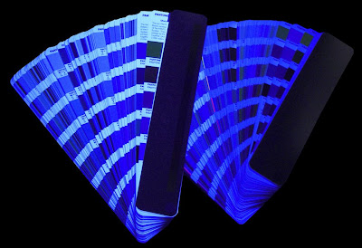
Viewed in light that has an ultraviolet component, the papers appear bright and blue. They have an apparent expanded gamut. However, the printed hues will mutate, or change color depending on the light source. This effect is called metamerism and drives a need for light booths and an understanding of the viewing conditions when color matching or judging color. Simply put, printed hues shift, particularly in the highlight tones, when papers contain optical brighteners.

In reality, the rise in the use of brighteners can be attributed to a host of reasons, including production efficiency for maintaining a consistent look to a paper with changing content and a desire from customers for a brighter sheet at lower cost.

Another, more subtle problem can be the intended colorcast of the sheet. While in some ways we might consider OBAs an unintended colorcast, designers will sometimes purposefully choose a paper that has a colorcast.

The inks that are typically used in four color process printing block, to varying degrees, the fluorescence in papers containing OBAs. Black and magenta block the greatest amount, yellow a lesser amount, and cyan ink least of all. What this means is that when an image is printed using a halftone screen, lighter/pastel tones allow more more of the brightening and color shift of OBAs (towards blue) than the shadows. Color is effectively skewed towards the blue from shadows to highlights – but only when the paper being printed on has a high OBA content.

-----

Maintaining proper viewing conditions for print evaluations is a key part of color management.

The standards for viewing booths have changed over the past couple of years with the most recent release of ISO 3664 Graphic technology and photography — Viewing conditions.

If paper contains optical brighteners, color matching must be done in reference light conditions. When proofing on job stock that contains optical brighteners, it is important to critically examine both separations and curve effectiveness in the cyan containing highlight areas. The cyan/yellow color balance is hardest to achieve with these papers.

Even proofing papers contain optical brighteners. Creating profiles on these papers requires interpretation and tweaking if the press papers have a different level of optical brighteners or if the press papers have no optical brighteners.

Finally, optically brightened papers lose their fluorescence over time especially if exposed to light. The paper yellows. Print hues shift. Once printed, there is no recovery of the original paper whiteness so this should be kept in mind when a job reprints. Trying to match a first printing several months after completion is almost impossible. New proofs are a minimum requirement.

What additional tools can color management bring to the table to help tame the paper problem?

Traditionally, the way to “solve” OBA problems was to ignore them, primarily by using a filter that cut the UV light to stop it from hitting the paper and thus prevented the brightening effect of the OBAs. This is still a very effective approach to process control, but it is no longer the norm in color management. The other way we ignored it was by doing just that, not acknowledging the problem.

Today, we are much more likely to solve the OBA problem by quantifying the amount of OBA by including the UV in the measurement and then adjusting the ICC profile to compensate for its presence. Some recent color solutions provide Optical Brightener Correction (OBC) technology, which allows you to fine tune the profile results by evaluating specific test charts against a series of Munsell color standards in the target viewing condition. This combination of physical standards and measured results allows for a uniquely precise correction for optical brighteners.

An additional parameter that can be handled in color management is the final viewing environment. Traditionally, a graphic arts workflow targets a daylight illuminant (usually noted as D50/2 – describing the illumination and viewing angle). One additional way to fine-tune the result is to define the viewing condition of the final destination or illumination at the intended point of use if it is not D50.

This can be done by either using CIE defined illuminants or by actually measuring the lighting in the final environment.

-----

And what about Glossy Paper?

Paper gloss is related to surface roughness and therefore affects color reproduction. Light of all wavelengths is reflected from the surface of paper. How it is reflected defines both its gloss and dot gain characteristics.  

If the paper is glossy and smooth, it scatters less light and there is less dot gain. Light is reflected almost like a mirror (specular reflection). 

Matte, dull and uncoated papers scatter more light resulting in more dot gain. Also, these papers require more ink to achieve a given density further increasing the dot gain. 

Papers from different manufacturers absorb ink and toner/developer solution differently. There is no overall standard for surface roughness, ink absorptivity or developer absorptivity within the paper classification scheme. For the most accurate color, press profiles should be made on the chosen stock for a particular job. 

Matte and uncoated papers are even more variable.

The best color reproduction will occur on:
  • Bright papers with uniform spectral reflection;
  • Papers that are smooth and glossy;
  • Papers that are neutral in shade; and
  • Papers that exhibit minimal fluorescence.
One curve for all paper surfaces leads to less than optimum color.

----------

Do you have a color management question, horror story or event to share?
Email me at reilley4color@gmail.com

2.08.2016

Tips for Great Color


Tips on Producing Great Color


Good color starts by calibrating all of the devices within the color work flow.
Devices should be calibrated often to ensure that they have not “drifted.” The frequency depends upon your reliance on color. As you know from reading this blog, calibrating brings the device to a known, stable state, and is a baseline.

Calibrating your monitor is just as important as calibrating the print device.
Whatever color space you might be working in, unless your monitor presents you with controlled, managed color, what you see will not match what you get. First, it’s important to think about the problem correctly. The goal isn’t to match the prints to the monitor or the converse. The goal is to make sure both the monitor and the prints reflect, as accurately as possible, the information that is actually in the digital file. There are lots of methods for calibrating your monitor, and it can get quite involved.

Here is a video showing how YOU can calibrate your monitor for FREE.

The major manufacturers of monitor calibration packages for the casual user are Datacolor (the Spyder series ), X-Rite (the i1 series, PANTONE Huey and the ColorMunki) and Integrated Color (ColorEyes Display Pro). All these products are of excellent quality. The first two have several price levels of packages with varying capabilities.

The more expensive packages may include features you don’t need, such as printer profiling and projector calibration, and the ability to customize calibration settings beyond the defaults. The accepted standard is to calibrate to a color temperature of 6500K, a gamma of 2.2 (for both PC and Mac platforms) and a luminance of 90 cd/m2 and these will be the default setting in all the packages. But some of the less expensive packages may not do everything you need, such as luminance adjustment. Check the details.

Some laptop screens may not be able to be calibrated properly, and older or very inexpensive computers may not be able to use a profile. Apple laptops will need the ColorEyes software mentioned above.

An issue with Windows is a utility called Adobe Gamma. If it is in your Startup file it will be loaded on startup and override your calibration settings. Simply go to Start > Programs > Startup, right click the Adobe Gamma Loader and click Delete. (If it’s not there, don’t be concerned.) Don’t be nervous about doing this. It only turns it off as a startup item; it does nothing to what is installed your computer.

A custom ICC profile should be created for each device within the Color Supply Chain.
This process ensures accurate and automatic translation of color values from one device to another, minimizing time and waste during the production process. A Device Link Profile can be established to link devices commonly used in the production process, eliminating the need to specify individual device profiles each time.

Paper, inks and toner impact the ultimate color result. Creating individual device profiles for each paper type, ink and/or toner used delivers a more consistent result. For example, if a proof is being generated on a glossy, coated stock, but the final product is being produced on a matte uncoated stock, these custom profiles can produce a more consistent result.

Spot colors can add time and cost to a printed project. Not all spot colors can be faithfully reproduced with CMYK four-color process. Designers and printers should carefully consider the colors that they are using within the context of the project’s budget and desired outcomes. Many tools exist that can help users determine whether or not a special color can be faithfully reproduced using a CMYK match. It is often necessary to use spot colors to consistently match special corporate colors and to ensure absolute color consistency across a distributed printing process.

Make sure you aren't "duplicating" any colors. 
Look through the color palette in your page layout software. Remove any duplicate colors you find, and reassign the corresponding objects and layers accordingly.

Make sure you give your colors the same names in each application you use for the project. 
For example, make sure you give the color the same name in InDesign as you give it in Photoshop and Illustrator. This will help reduce confusion and ensure the colors separate properly when preparing the piece for print.

Communication among all constituents in the color work flow is essential. This communication should include sharing of ICC profiles, discussion about paper and ink types and proofing models, and more. In doing so, good, consistent color can be produced across widely varying geographies and output technology types.

Using a good RIP in the production process is a critical element in the color work flow. It alleviates many color issues and reduces training challenges. Consistency in settings within the RIP is key to delivering repeatable and known color.

When using digital cameras or scanners for input, if you want your colors to be consistent from shot to shot, or scan to scan, include a color target in the first frame/scan of a sequence. When it comes to processing, set the grey point (and black and white points) using the target reference frame, and your software will match the subsequent batch of images.

Always color correct images in the largest RGB color space available. When images are converted from RGB to CMYK, you lose color information—a lot of it. As a result, you (and your color management tools) have fewer colors to work with, or average, when attempting to make color changes to an image. Also, when images are converted from RGB to CMYK, you’re creating the black separation and reducing the amount of CMY in the image at the same time. Depending upon how much CMY is eliminated in the separation, it can be very difficult—or even impossible—to make color adjustments to an image.

When designing for color output, avoid large solids. While lithographic presses have the ability to reproduce solids evenly, toner-based devices have a tendency to mottle, show unevenness, or even banding. This is because ink and toner are radically different materials. When toner is applied to paper, it is dry. Toner is not actually absorbed into the paper fibers, instead, it is fused to the sheet using both heat and fuser oil, creating a bond. Consistency lies in how evenly the toner was applied to the paper, and how evenly it was fused to the paper.

If tints and large solids must be used in a design, there are some ways to help counteract the uneven appearance associated with toner-based devices. First, try applying a filter (Photoshop Add Noise or Texture filters work well) to the large tint or solids. Another option is to also break up large color areas with other design elements such as text, images, or illustrations.

----------

Do you have a color management question, horror story or event to share?
Email me at reilley4color@gmail.com

2.01.2016

Device Link Profiles

Color profiling software also can generate device link profiles.

A device link is a type of International Color Consortium profile that contains two profiles inside of one. In order to create a device link profile, you select the two profiles, along with settings, and then save these ‘linked’ profiles as a device link profile. A device Link profile always contains a source color space and a destination color space, and the conversions always move from the source color space to the destination color space, saving time in file preparation and processing. They are most useful to people who repeatedly use the same specific configuration.

Why might device link profiles be required?

One example is when a scanner application does not embed the source profile in the document containing the image it creates. Storing the scanner’s profile eliminates the need to request the appropriate source profile each time the user wants to print with a configuration involving that scanner.

Perhaps a user also may want to see how a scanned image looks when printed using a specific printer, or may want to look at many images captured on the same scanner at different times before printing the final image.

Since the same devices are involved each time, the graphics application displays a list of device link profiles that the user had previously created for various configurations, allowing the user to select the appropriate device link profile for the current activity.

Another reason to use device link profiles has to do with maintaining channels in color conversions. Typical ICC color conversions require all of the colors in the file being converted — including the black channel. device link color conversions allow the user to maintain the K channel so that the color conversion can happen without any changes to the K channel — such as converting K type to CMYK type. This can be important when making color conversions for certain types of inkjet proofing where you need to maintain the black channel.

It is even more important for making color conversions during plate generation. When used during ripping or plate generation, the black channel must be maintained and device links are a must. In this scenario the device link is used to make the press simulate another printing condition, or to match a printing condition such as GRACoL. Not every platesetter RIP can use device link profiles, but many can, and for those with RIPs that can’t, there are third party applications that can provide these conversions.

Device links are a required component in conversions between different printing conditions, e.g. from offset to gravure. Black channel conversion is achieved with exacting results. Whether single black or rich black output is specified, the device link will manage the requirement.

Currently device link profiles can’t be embedded or assigned in applications like Photoshop because they contain mathematical information for a color conversion rather than describing a color space. Because of this, device link profiles are more complicated and less flexible than traditional ICC profiles and are classified by the ICC as a special type of profile.

A few other points about device links:
  • only one rendering intent is available, that which was selected at the time the link was created. 
  • links cannot be embedded into images 
  • the rendering intent encapsulated in the link is selected in the 'default intent' field in the profile's header. 
  • a profile sequence tag in link profiles documents the profiles used to create the profile. 
If you are looking to create your own device link profiles, I personally like the iPublishPro 2 software from XRite.
-----------

Do you have a color management question, horror story or event to share?
Email me at reilley4color@gmail.com

1.18.2016

Calibration and Profiling


Our first reader question!

"Hi great blog, I've learned a lot already. I thought I would ask you a question that confuses me - what the heck is the difference between calibrating and profiling a color printer? The technicians talk about it like they are the same thing. Is that the case?"
~ Daniel M. - Pelham Print

Hi Dan, thanks for asking. The short answer is - Calibrating is putting the device into a known, stable state, a benchmark. Profiling is using that benchmark as a translation filter at either end of the color work flow.


Maintaining a reliable color environment is essential for the production of accurate and consistent color every time. To achieve a reliable color environment, calibration, profiling and measurement of output devices are critical. A number of affordable solutions exist today that combine all the hardware and software essential to these tasks. To be successful, it’s important that all of the elements in the Color Management work flow are speaking the same language or integrated with each other.

Color management works by two key process - calibration and profiling.

Unfortunately the two processes are often confused with each other, and consequently many people have a poor understanding of what they're all about. It's quite simple really, and this page aims to explain the difference and give you an idea of what's going on, at a basic level, in colour management.

Put simply:
  • Calibration sets the device into its best native state using its hardware controls. 
  • Profiling is the process of measuring and fixing up any remaining inaccuracies in its colour output (by modifying the signal going into the device). 

Calibration is using hardware adjustments on a device to set the device into a known, repeatable state (ideally close to some absolute benchmark for that device's behavior).

The frequency of calibration required varies on the print environment and its associated quality standards. In some environments, operators calibrate devices daily or every time that they start a new job or introduce a different paper into the production environment. In other cases, devices may be calibrated on a daily, weekly or even monthly basis.

When calibrating, certain output devices, such as those systems using Fiery, you don’t need to test it with a profiling solution to achieve consistent and/or accurate color. On other systems without Fiery’s capabilities, it is important to use a profiling solution to test the profile patches that go to the printer. Profiling is used to characterize the printer and to ensure optimum color output. Calibration is used to re-set the printer to this optimal desired state.

To help you understand what a profile does, think of it as being like a Photoshop adjustment layer or curve that is applied to and “fixes” the images you see on your screen. It is similar to a Look Up Table (LUT) that contains the "recipe" for converting from one color space to the colorspace of a particular device.
Profiling solutions generate ICC profiles that characterize the device, allowing a better understanding of its color capabilities. ICC profiles provide a cross-platform device profile format that ensures consistent, device-independent color throughout the entire Color Management work flow. Printer profiles are small files that describe the gamut (range of printable colors) of a specific printer's paper and ink/toner combination (they have a .icc or .icm extension).

Manufacturers typically ship output devices with default profiles, but many operators choose to develop custom profiles to achieve better color results for particular paper characteristics or the characteristics of the printing device.

A color measurement device reads the test pattern/patches. Since spectrophotometers are the most precise, they typically deliver the best results. The on-screen test pattern/patch results are compared to the numerical values associated with the test pattern.

Profiles are generally categorized in the followingways: input profiles (for scanners and cameras); display profiles (for monitors andprojectors); editing space (or working space) profiles, which are often embedded in digital files, such as JPEG or TIFF files; and output profiles (also known as printer profiles).

A solution such as Profile Inspector in Fiery Color Profiler then accepts the profile, and it is uploaded to an output device such as Fiery. This process allows accurate color to be maintained by the output device.

Why is Profiling Important?

Profiles help designers and others early in the Color work flow to better predict the way colors will reproduce at later stages in the process. This color control early in the Color Supply Chain saves time and decreases waste as the job progresses.

You can order standard profiles, or have custom ones built for you. Digital Dog is one such vendor, and ITSupplies builds them for inkjet.

Here is a link from Adobe to download most of the common North American profiles currently in use.


----------

Do you have a color management question, horror story or event to share?
Email me at reilley4color@gmail.com

1.13.2016

Color Bars

Color bars are printed in the trim area and are used for quality control purposes by the printer.

Squares of colour are printed on the area of the page to be trimmed off, which the printing press operator uses to check colour density and consistency is maintained. This checking process is automated by some printers, with digital scanners tracking the colour bars to ensure quality and consistency is maintained.


  • Unlike the live image area of the press sheet, color bars are consistent job to job. Therefore they are more efficient at providing a benchmark and can be used to track trends in variation over time.
  • Color bars can be tailored to meet the needs and measurement capabilities of individual print shops.
  • Color bars may be used to measure all aspects of the "print characteristic" - solid ink density, overprinting (ink trapping), dot gain, grey balance, as well as issues such as slur and dot doubling.
  • Color bars can reveal issues with ink hue, blanket condition, impression cylinder pressure, etc.
  • They can be used forensically to help understand why a specific job did not meet expectations.
  • They are efficient since, unlike the live image area, they are a constant made up of well defined elements that continue from proof to press sheet.
An offset printing press is essentially a complex machine for laying down a specific film thickness of a specific color of ink onto a substrate. The digital version uses toner electrically charged then fused onto paper. The ink or toner is metered out in zones across the width of the press sheet according to how much coverage is required for each color in each zone.

The trick is that if you are producing a critical spot color with a build of process inks, those inks and all associated print attributes need to be “spot on.” The best way to control critical press factors like density, dot gain, print contract, etc. is to measure as many color bar patches as possible.

Color bars can serve many purposes. They can be used to determine color accuracy against a given standard or to determine a proof’s accuracy against a final print.

Color bars also can be used to measure consistency for the duration of a long print run, from job to job when a print job is reprinted, or between two similar printers.


So, ranked in order of importance, here are the patches we suggest for a four color press color bar.


  1. Unprinted substrate patch (to zero out substrate when necessary)
  2. Solid patch for each process (and spot) color (needed for solid ink density (SID))
  3. 3/Color Grey patches at multiple tone values
  4. Mid-tone patch for each process color (to gather dot gain (TVI) values)
  5. Process color over prints (needed to measure trapping efficiency of inks)
  6. Additional highlight and shadow tone patches of each process color (for a 75% patch to calculate print contrast)
  7. GATF Star targets or microline targets (used to visually evaluate for press slur and doubling issues)


The items listed above are important and truly necessary, but if space is an issue, start with No. 7 and work backwards removing items until the bar fits. Also, items 3 and 4 could be easily reversed, but having one without the other makes diagnosis of grey balance issues difficult at best.

Grey balance targets

Grey balance targets are made up of a patch of three screened process colors that are balanced so as to appear as neutral grey under standard printing conditions. They are typically printed adjacent to a black screen tint of a similar value to allow for a quick visual, or measured, evaluation of how grey balance has shifted.

Grey balance targets can be useful since variation in any of the three process colors because of dot gain, slur, doubling, density, trapping, and registration will be reflected by a shift in hue away from neutrality. The 3/C patch will take on a bluish, reddish, or greenish color cast.

The idea behind this target is that any grey balance color shift away from neutrality suggests a possible color shift in the live image area. However, in production printing the grey balance target may not be a reliable indicator of presswork issues.

Color bars are not a requirement for quality printing, however, they are key to making proofing and printing more efficient and effective while reducing overall production costs.

Color bars are available from a variety of sources, including IDEAlliance (at no charge) and iStockPhoto.

Many imposition packages also include color bars in their imposition templates.

Another option supported by industry standards is the Ugra/FOGRA Media Wedge CMYK, which monitors the quality of digital proofs. It also can serve as a digital control aid to monitor the effect of imaging in CMYK mode and other prepress work.

The CMYK tonal values of the Ugra/FOGRA Media Wedge are based on ISO standards. The Ugra/FOGRA Media Wedge is available for purchase from FOGRA.

----------

Do you have a color management question, horror story or event to share?
Email me at reilley4color@gmail.com